journal
« I’m a Winner! • Portfolio Expansion I »
Creating: curtisgroup.com
Posted on 8th May, 2005 at 7:35pm by joel
“Creating: curtisgroup.com” is the first entry in my “Creating:” series of journal entries. Each “Creating: …” will discuss a portfolio piece and some of the thoughts and techniques behind it.
Curtis Marketing Group specializes in dental marketing for some of the most image-conscious professionals in the dental marketing field. They needed a site that showcased the unique style for which they are known, but that also presented content in an efficient way to convert curious visitors into eager clients.
In early 2004, we (as I type this, I am an employee of Curtis Marketing Group, Inc.) finally decided that the curtisgroup.com web site needed a facelift. The site had been showing its age (it was over three years old), was search engine unfriendly, and was generally sparse on content. From a web geek’s standpoint, it was also woefully outdated code-wise, as it was entirely built of presentational table-based markup almost completely devoid of CSS.
The [first] redesign landed at the end of March. I had started completely from scratch with both the design and the code, beginning fresh with XHTML 1.0 Transitional for markup and CSS 2 for presentation.
Mark rewrote text and organized the layout of the site. The entire project went together relatively painlessly and quickly. I was just getting my feet wet with standards-based web development, so this was a learning process for me. When all was said and done, I was mostly happy with the finished product. However, as I continued learning about “proper” web development, there were a lot of things I wanted to change.
starting over
I would get my chance barely two months later. Through careful tracking of our usage statistics, we came to learn that the new site was harder for visitors to use and generated far fewer requests for information than did the old site. We had several long meetings about the flaws and problems with the site and the results were not pretty. The main buttons were too small, the text on the homepage too confusing, the organization too convoluted…among [many] other things.
When we sat back and looked objectively at the site, it was apparent that it was not only unsuccessful, it was a complete and total mess.
Mark and Susan had been at a large dental convention at the end of April and the booth design that I came up with had been a huge hit. We worked on creating a web site design and organization that echoed that of the booth, but after much agonizing and seemingly endless revisions, I was getting nowhere. Mark kept asking for something more “mystical and loose, almost dream-like.” No matter what I tried doing with���and to���the booth design, I couldn’t produce “mystical” or “dream-like.” We decided to put the redesign on hold for a while.
However, like many designers, I couldn’t put it on hold. In a fit of rage that evening, I sat down at my laptop and threw out everything I’d done so far and started with a blank canvas. I had never designed while angry before; I tried shapes I’d never tried, used colors that didn’t belong, threw around graphics that seemed completely out of place.
The finished product was definitely “loose”, if not “mystical”. Show-and-tell the next day resulted in an “I love it!” from Mark and after some tweaking and polishing, we had a site design.
a better-built site
Despite the fact that the first redesign had been carefully built with structural and presentational code kept separate, installing the new design wasn’t as simple as swapping stylesheets and uploading new images. The overwhelmingly unsuccessful organization of the site and my acquisition of a considerable amount of new knowledge combined to force another start from scratch. Again, Mark rewrote and reorganized text and again, I started fresh with my code.
The result was cleaner, more semantic XHTML and smarter CSS. Of course, the site also featured a much more interesting and user-friendly design with three main features: more obvious and descriptive buttons; a modular main content area that could support one-, two-, and three-column layouts and combinations thereof; and a more useable and apparent sidebar that we could stuff full of interesting, though secondary, information.
how it all comes together
So what makes it “work”? I’m glad you asked. The three points from the preceding paragraph, coupled with the overall design, are our focal points.
the design
The single most important thing about the design is “orange”. That’s right, orange. Both the old-old design that we replaced in March and the short-lived old design this one replaced adhered to the “use the colors from the logo only” principle. As a result, they relied only on brightness, contrast, and the subtle differences between blues and greens to differentiate regions and express details. While largely monochromatic designs are not inherently bad and some work well (*cough*my capri theme*cough*), this had not been the case.
And so, in my rage a reddish-orangey color was added to the design quite spontaneously and it works exceptionally well. It keeps things interesting, brings attention to important areas, and frankly, looks great as an accent.
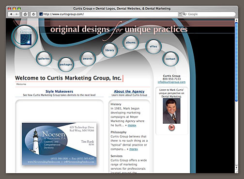 The curtisgroup.com home page showing the “mystical” header, reddish-orange accent color, a layout featuring two unequal columns, and the sidebar containing a welcome from Mark.
While the orange is the most important part of the design, the most obvious and eye-catching part is the “mystical and loose, almost dream-like” treatment of the header graphic. It’s interesting to look at, immediately declares that “Curtis Marketing Group cares about design above all else”, and is distinctive enough to be memorable. It’s also very practical.
The swirls bring the viewer’s eye from the corporate logo, through the main buttons, and down to the contact information and interesting tidbits in the sidebar before releasing to���and nicely framing���the main content area. The single biggest problem with the previous site design was that visitors came to the homepage and didn’t know where to go from there. This is no longer an issue.
the buttons
Besides being big and round and glassy and placed in such a way that the viewer’s eye is forced to scan them before wandering to the content, this incarnation of the main navigation buttons provides much more feedback as to what is found behind them.
Rolling over a buttons pops up additional information about a possible click of said button, and while the idea of “remote” rollovers is not new, an all-text, search engine-friendly, semantic, no-javascript method that degrades nicely in browsers that have problems with modern CSS is quite cutting-edge.
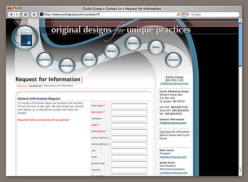
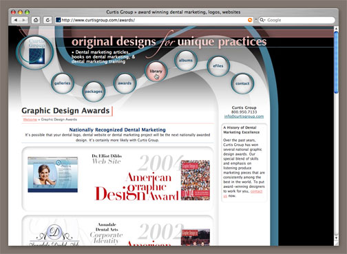 This internal page shows the single-column layout option and a user rolling over one of the main buttons to reveal the descriptive text.
The secret is Eric Meyer‘s pure css popups. This technique allows a writer to create long, descriptive links that searchers and users love while letting the designer keep the clutter and unpredictability of those links to a minimum by showing the descriptive text wherever he so chooses and styling it accordingly.
I’d produce code samples and explain just how I made these rollovers work, but I think Eric does it far more effectively than I ever could, so I’ll again point you to his demo.
Just like that, we’ve got big, bright, noticeable buttons that provide considerable additional information about what the user will find upon a click. Cool, huh?
modular columns
The main content area of this site was specifically designed to hold content in a multitude of ways that could all be interchanged quickly and easily. We can minimize scrolling by pulling multiple section headlines up into several columns or allow text to flow the full width of the content area to make reading large blocks easier. Here is a list of the possibilities:
- one column
- two equal columns
- three equal columns
- two unequal columns in which the first and second or second and third columns of the three-column layout are combined
- any stacked combination of the above options���for instance, two unequal columns in the first row with a single column beneath
Every column starts and ends the same way in the HTML with the only difference being the class applied to said column. The CSS sizes the columns appropriately, applies the correct background images, and takes care of all of the positioning. Both the HTML and CSS required are clean and minimal, which makes for a fast-loading, flexible layout.
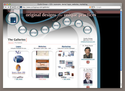 Here we can see the three-column page layout option.
In addition to determining the number of columns, both the CSS and HTML have provisions for using more than one rounded shadow box per column. So, if I wanted to make two rows of three columns each, I wouldn’t use the three columns twice each, I’d make two rows of shadow boxes per column.
As I write this, changing the layout of a page requires editing the HTML to determine what column setup is used. Purists will note (and I have done so) that using classes in the HTML to change the presentation of the page flies in the face of content-presentation separation. While I do agree, I’ve yet to develop an alternative method for this particular site that would allow me to use completely presentation-free class names (or IDs) on the columns and still control the layout with a reasonable amount of CSS.
Also, the column layout is rarely���if ever���changed unless the content of the page is being changed. I would have no reason to change a three-column layout to a two-column layout unless I was deleting the content of the third column. I’ve rationalized the presentational change of the column class as a necessary part of the content update. Feel free to disagree.
a functional sidebar
Lastly, but definitely not least of all, we have a functional, useful, noticeable sidebar! Now, sidebars on web sites hare hardly ground-shaking developments and the implementation thereof is simple and fast to do. However, making a sidebar useful and noticeable without taking away from the main content region can be a difficult task���or at least it has been on the different incarnations of the Curtis Marketing Group web site.
The original site had a crude sidebar grafted onto the table layout below the side-mounted navigation buttons. We never used it for content because it looked silly and detracted from the main content area. It was too wide and too similar to the important content to its right.
The worst sidebar idea ever created was attempted on the interim site I’ve dissed a few times. This sidebar was about half as wide as it needed to be and started at least 250px below the top edge of the content column. Shortly after realizing just how useless it would be, we removed it completely and widened the main region in an effort to smash more content into the layout.
 Again, we have a one-column internal page, but this time note the filled sidebar.
This current site gets it right, however. The sidebar fits flawlessly into the design, as the header flows directly into it. It is wide enough to hold content comfortably, but is narrower than the narrowest possible main content column. Like the main columns, the content in the sidebar sits in rounded shadow boxes, but these are shallower, fainter, and have tighter corners. Finally, the text is smaller and a slightly different shade of gray to further differentiate it from the main areas.
The sidebar is obviously a sidebar, but doesn’t look out of place or hide from the viewer. It’s the ideal place for us to put relevant information that wouldn’t fit in quite right if it were mixed with the main content.
final wrap-up
So there you have it: the creation of curtisgroup.com���or at least a substantial overview of the more important content and design features that make the site “go”. There is much, much more that could be said about the site, but I fear it would only be superfluous at this point.
This version of curtisgroup.com has been online for about 10 months now. We’ve gotten lots of good comments from visitors. Many have said that not only does it look great (*whew*) it’s extremely easy to find what they are looking for. That’s music to the ears of not only any web designer, but to any business owner as well!
Incidentally, we just updated all of the user-submittable forms to plug into our new sales and marketing management software, so hopefully the site will be even more effective in producing clients. As we learned so painfully with the site before, it doesn’t matter what it looks like, if the web site doesn’t do its job to produce clients for a business, it’s nearly useless.
Finally, I’m especially proud of this web site because I created it for the most demanding client of them all: my own boss and company. I’d be lying if I said that it was an easy process that went my way from start to finish. A lot of things changed as we went along: parts I was very happy with got stripped out, content got added in ways that my aesthetic sense didn’t like so much, and so on.
All in all, the site does its job well, looks good, and everyone (and this never happens) at work is happy with it. Are there things I want to change? Absolutely. In fact, I cleaned up a bunch of code while writing this little article. It will never be perfect, but at the moment it is functional and the code and design are both of high enough quality to be shown off to you, my readers (both of you).
So, what do you think? Feel free to critique in the comments.
You may also visit the much more concise portfolio page which also includes links and short explanations of a few of the other tricks and features of the site not mentioned here.
Or, visit curtisgroup.com and explore for yourself.
Filed under: Creating:, portfolio, webdev
You can follow any responses to this entry through the RSS 2.0 feed. Both comments and pings are currently closed.
2 Responses to “Creating: curtisgroup.com”
archives
last 12 posts
- R.I.P. Steve
- Save the Date
- SOLD!
- Countdown
- It’s time to blow this thing up
- For Sale
- Helvetica
- The Web Design Survey 2007
- HB2Me
- A Hero Departs
- A Week With Family
- I am a statistic
all categories
- view all ›
- Apple (3)
- art (3)
- cars (1)
- Creating: (2)
- creative writing (1)
- graphic design (8)
- meta (15)
- portfolio (5)
- ramblings (22)
- rants (2)
- sports (5)
- St. John's (1)
- uncategorized (1)
- webdev (8)
1PuddleMonkey sayeth:
8th May, 2005 at 10:57pm
Orange is one of my favorite colors, and it works extremely well on the CMG site. Reading all this has made me extremely grateful that the two company sites I built are simple and require on HTML and CSS. 🙂
2BigMAC sayeth:
10th May, 2005 at 12:30am
I have it on the best inside knowledge that the President of Curtis Group is extremely happy with this website and the designer. Of course, there’s talk of tweaking the info on the Home Page – again.